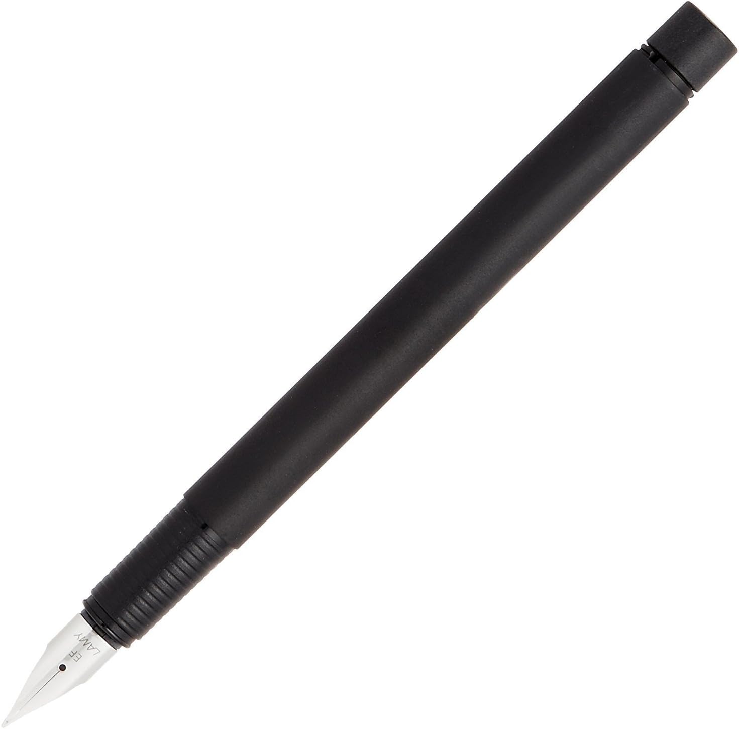
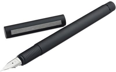
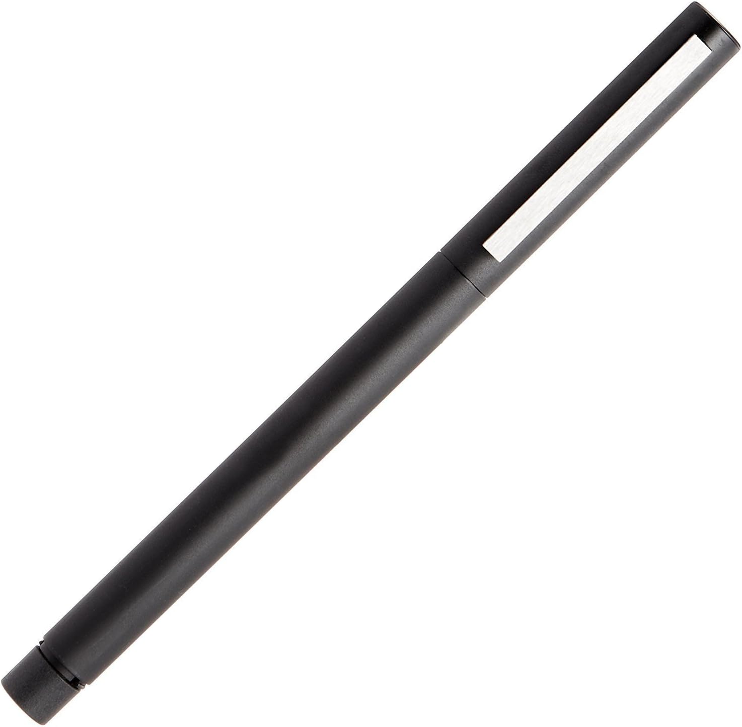
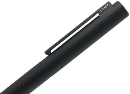
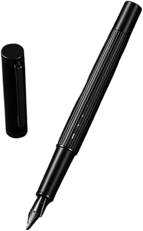
Let's go back to the Bauhaus era with the Lamy cp1 in matte black, when modernist design was distilled into an expression of industrial production and function, ditching both the tired and static encrustations of Victorian decor, and the dynamic organic shapes of Art Nouveau. Those imperatives produced some drab slabs of aluminim and concrete for sure, but this pen is a machine for writing, and also for being slim and elegant. Right there we've violated one strand of Bauhaus ideology, that consumer predilections should not dictate design elements. Curiously, this pen, while hewing to the purest dictates of minimalist, industrial, and utilitarian design, fulfills my personal expectations, and satisfies too. Maybe it does this by being sweetly easy to hold and use, or maybe it's because we have all been trained, by now, to dig minimalist design. Or both? However we get there, this pen is reserved, but full of personality. To the particulars: It's a Lamy. That means it's reasonably priced for its design and materials, it's exquisitely engineered, and it writes perfectly, first time and every time. The finish feels organic and friendly, for painted metal; the cap clicks off and on with a resonant, precise click; and the nib writes a little wet, moving easily but with a very slight hint of toothiness. Not enough to drag - just enough so I always know by feel where the nib is and where it is headed next. Reviews call it very small. It's actually not a short pen, but it is slim. With the cap posted (it clicks on the end of the barrel almost as firmly and precisely as onto the section to close it up), it's long, and heavier. The cap almost counterbalances the tip, but not annoyingly so. I have large hands and like fatter sections but it's got enough weight to it that I feel it clearly in my fingers. I would like a bigger section but it's O.K. I got the FINE nib, a good decision, Lamys do write generously, maybe not quite "wet" but plenty of ink comes along, so a MEDIUM might be too wet for everyday paper. I'm drafting prose in a vintage-enough Mead notebook, with nice hard paper. Also does well on everyday note pads, legal pads, Post-Its, and Claire Fontaine index cards. Using the Lamy blue cartridge that came with it, will run Quink in the converter when I can find it. Blue ink seems awfully bourgeois, doesn't it? I think black Quink -- the ink of the masses, by the way, and a stricly utilitarian color -- would be a better choice.